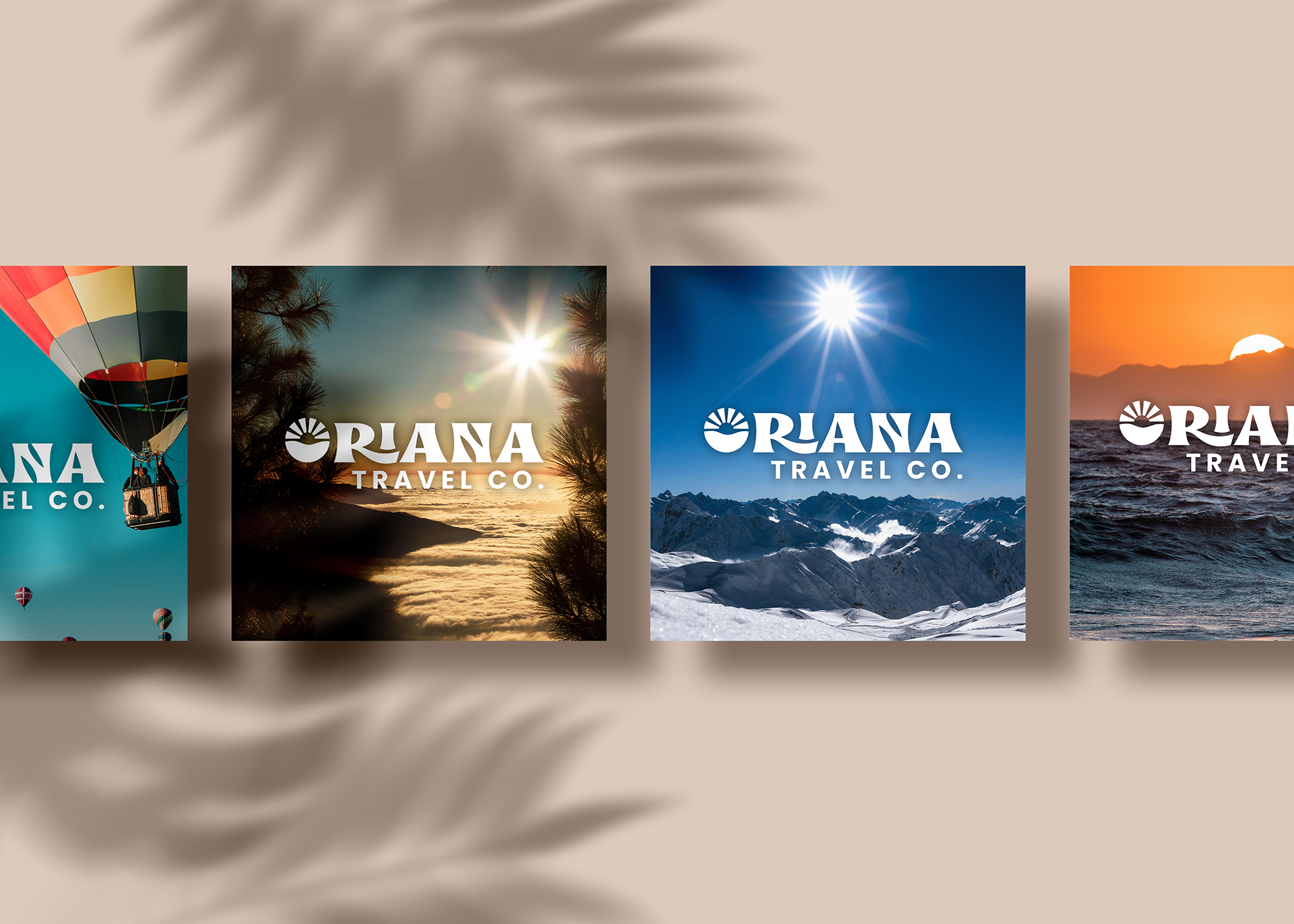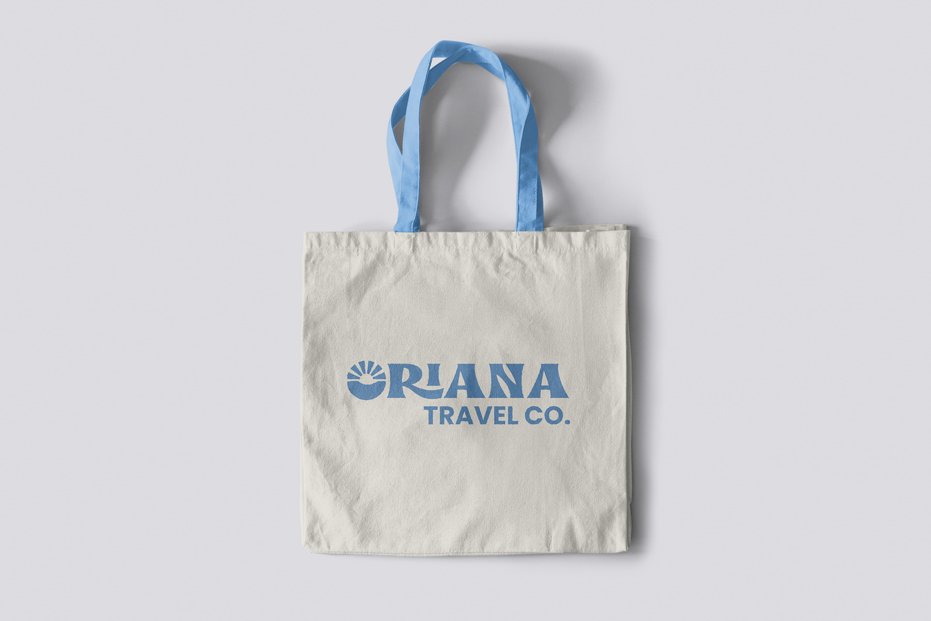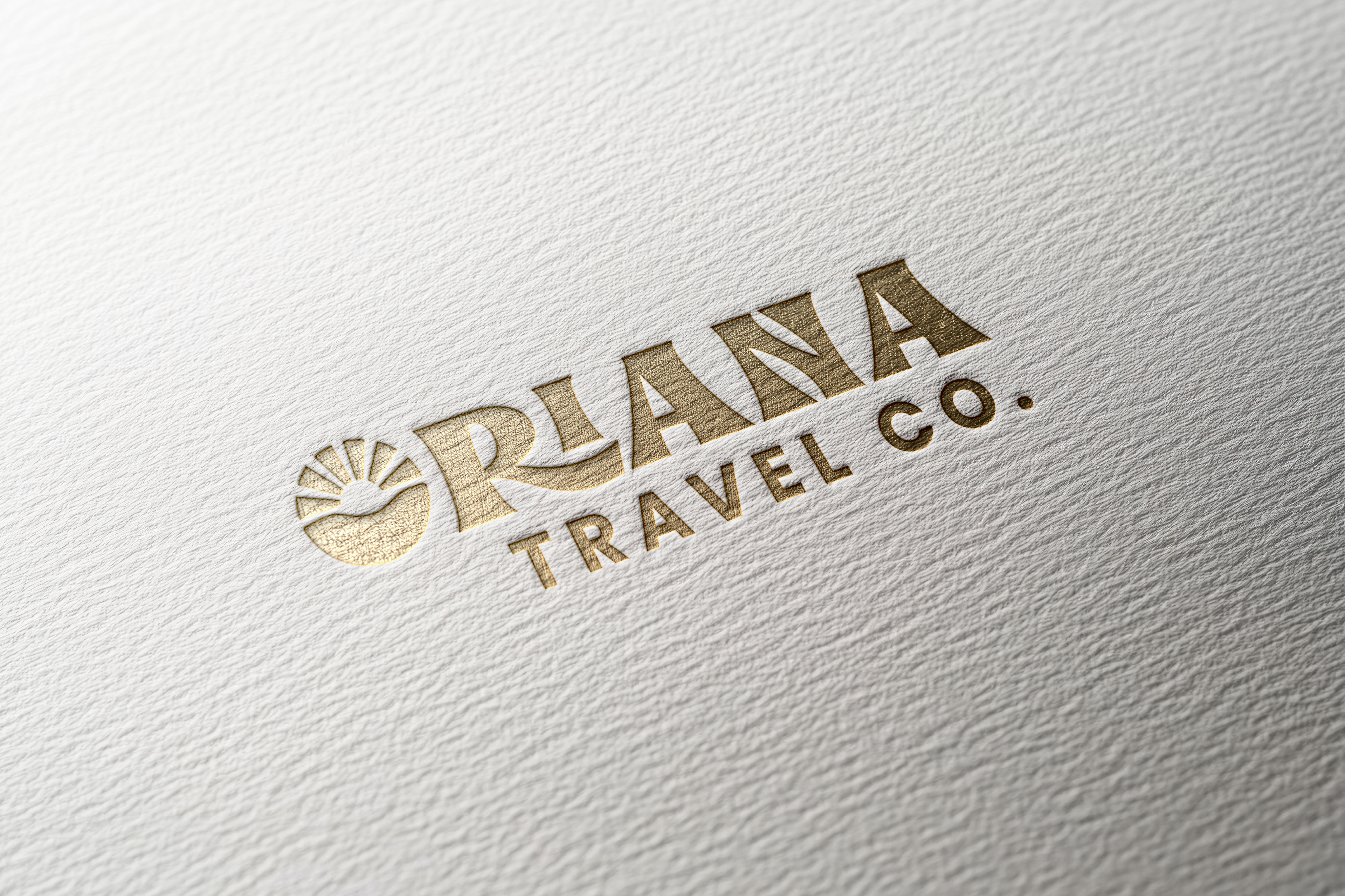
Oriana, meaning dawn or light in Latin, inspired the visual identity for this modern travel agency. The branding centers around themes of new beginnings and exploration, with a logo that incorporates sun and light elements to symbolize guidance and discovery. A nature-inspired color palette and modern typography complete the brand, positioning Oriana Travel Co. as a curator of luminous, uplifting travel experiences to journey beyond the ordinary. Oriana hopes to guide travelers toward their next bright adventure.